
Katie + Nathan: an urban, chic, Alaskan wedding suite.
It’s hard to know where to begin describing this project - as my first fully custom, large multi-piece suite, it will forever hold a special place in my heart. A friend had referred Katie + Nathan to Salt Water Press, and I had a generally positive outlook about the whole project knowing friends-of-friends are typically good people. And then I met them - and I swear to whatever universal force you believe in, it was a match made in Print Heaven.
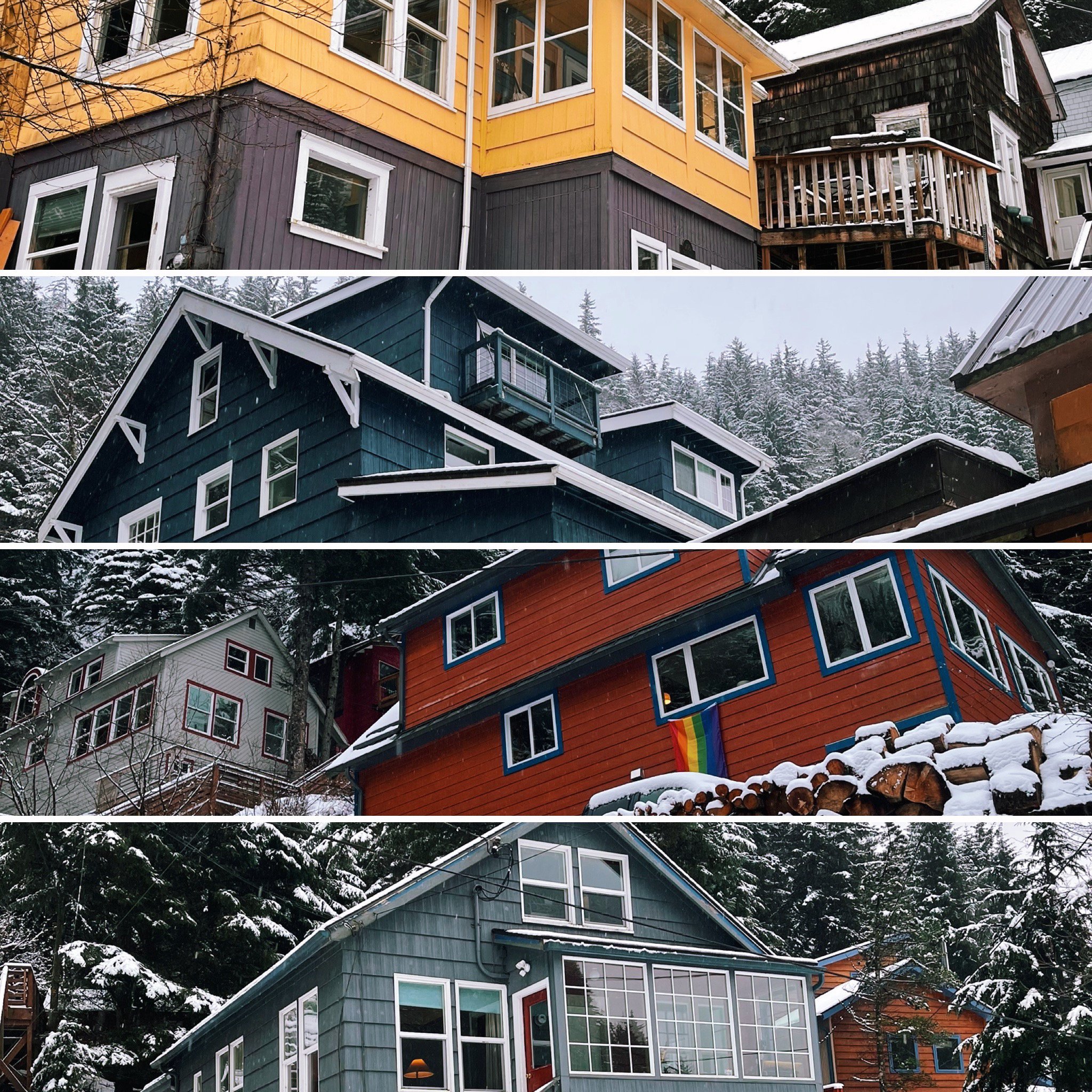
Katie and Nathan live in downtown Juneau, in an old and charming neighborhood we call “Starr Hill.” It’s a tangle of one-way streets. with many houses built in the early 1900s when mining in Juneau began to really boom. Some houses are only accessible via a system of stairways, and there are odd easements - sometimes you’ve got to walk behind 2 or 3 houses to get to your own. In the winter, the city plows rarely make it all the way up, and it’s a joint neighborhood effort to shovel out streets and driveways. Community is the lifeblood of Starr Hill, and honestly the best definition of “framily” I have seen in a long time - when your friends are so close they’re really more like family. Starr Hill is nestled at the bottom of Mt.Roberts, the main peak abutting downtown Juneau. It’s a beautiful mixture of colorful houses, windy old roads and zigzagging stairways against the dark, strong mountain.
When Katie + Nathan approached me about their invitations, it was instantly clear how special home and their neighborhood was. They were undertaking a large feat with their July wedding - over 200 people in a never-before-utilized outdoor setting (Juneau is not known for predictable weather), plenty of out-of-town visitors, and a full schedule of activities throughout the weekend. Their Starr Hill framily were all joining forces to make it an extra special few days, with a progressive cocktail party from house to house, and everyone spearheading a different aspect of the nuptials. Katie + Nathan’s own style was a classy but eclectic mix of deep hues and bright, bold accents. They had a beautiful vision of an upscale, formal wedding placed right on the water downtown. They loved letterpress and high end stationery (every printer’s dream!), and wanted their invitations to set the tone for their guests.
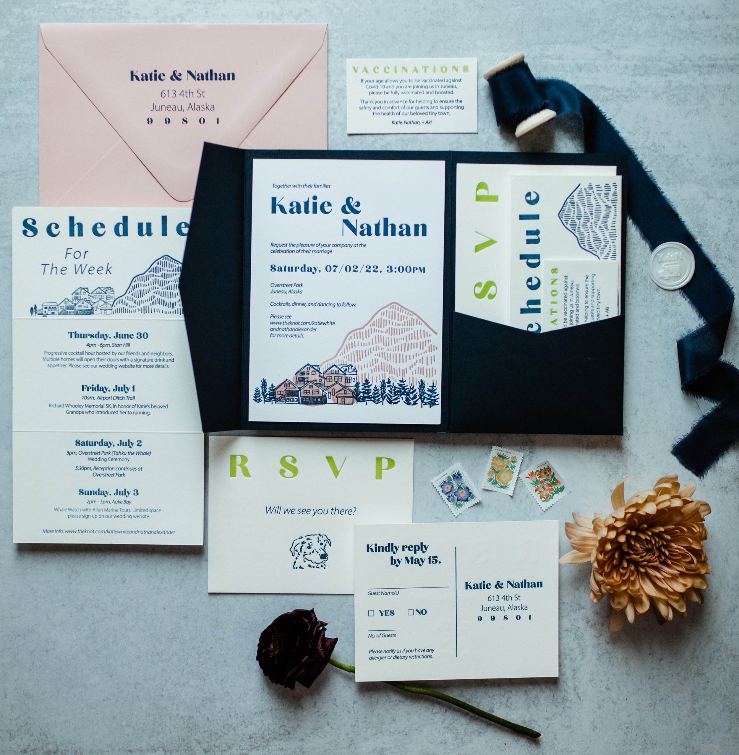
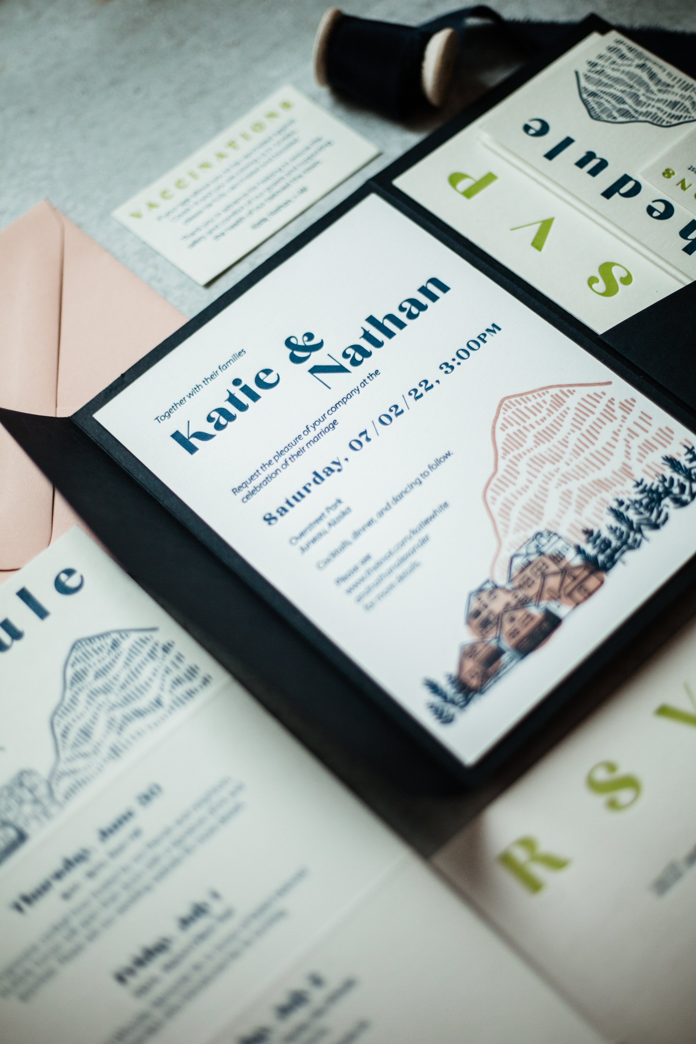
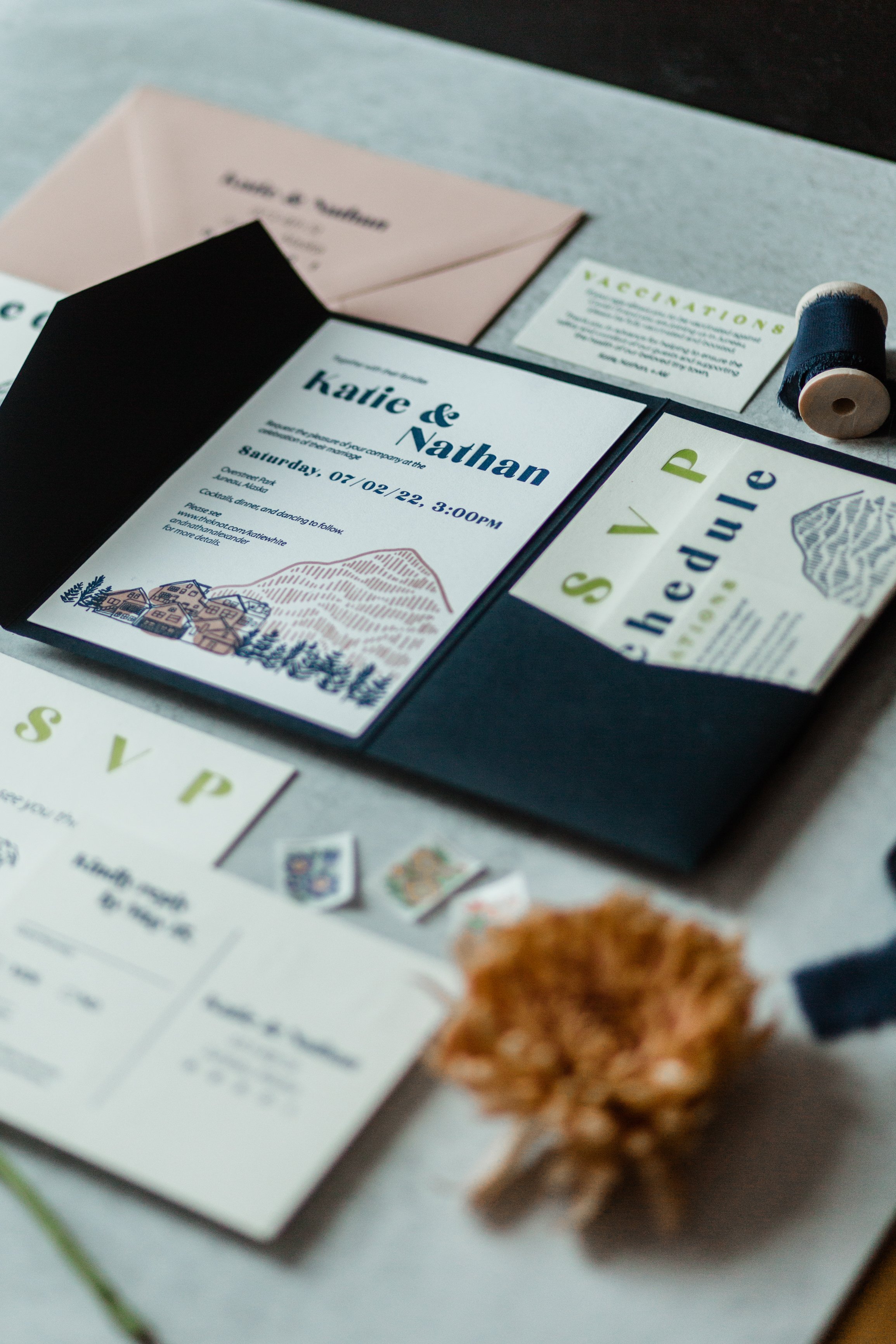
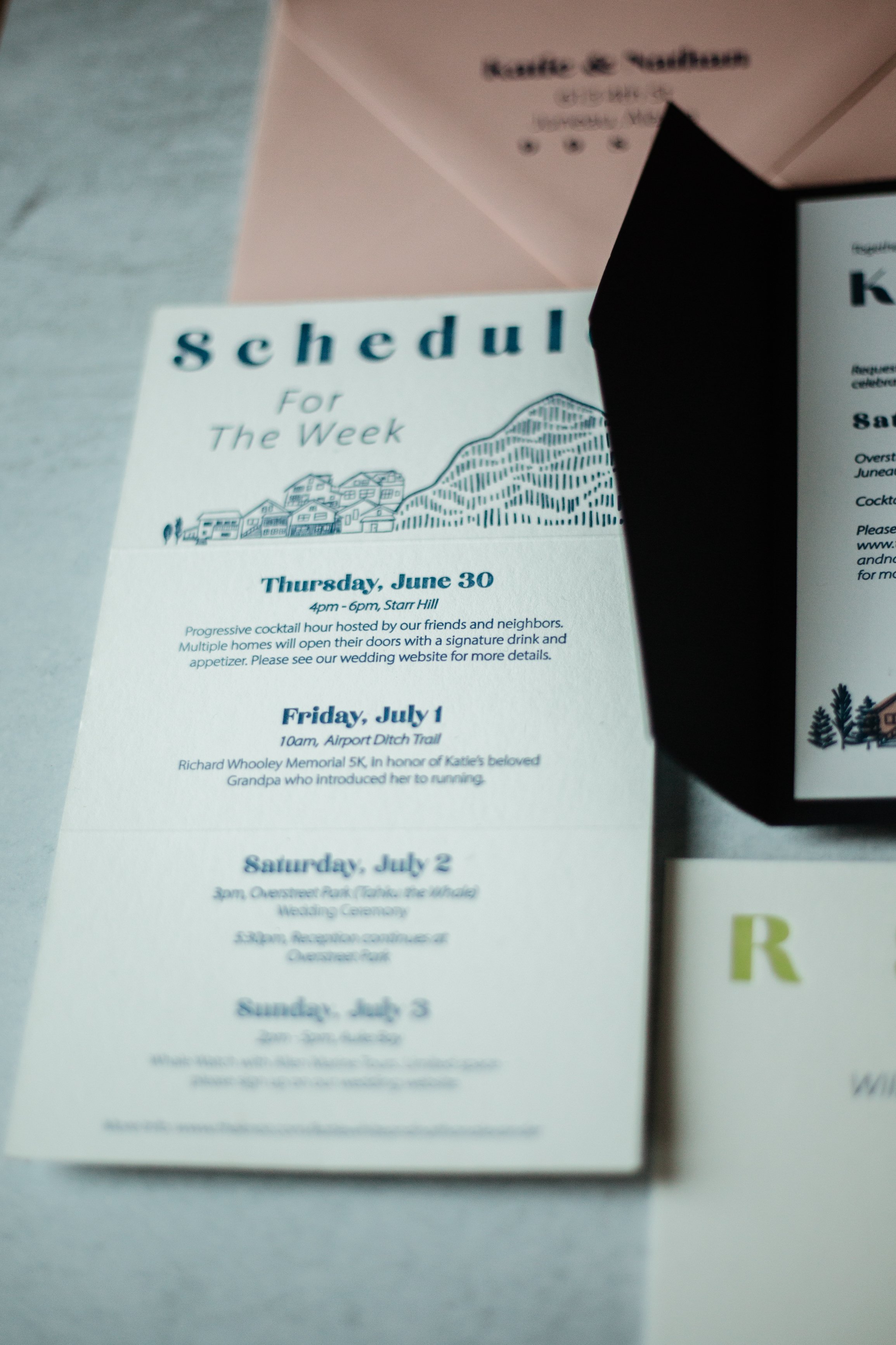
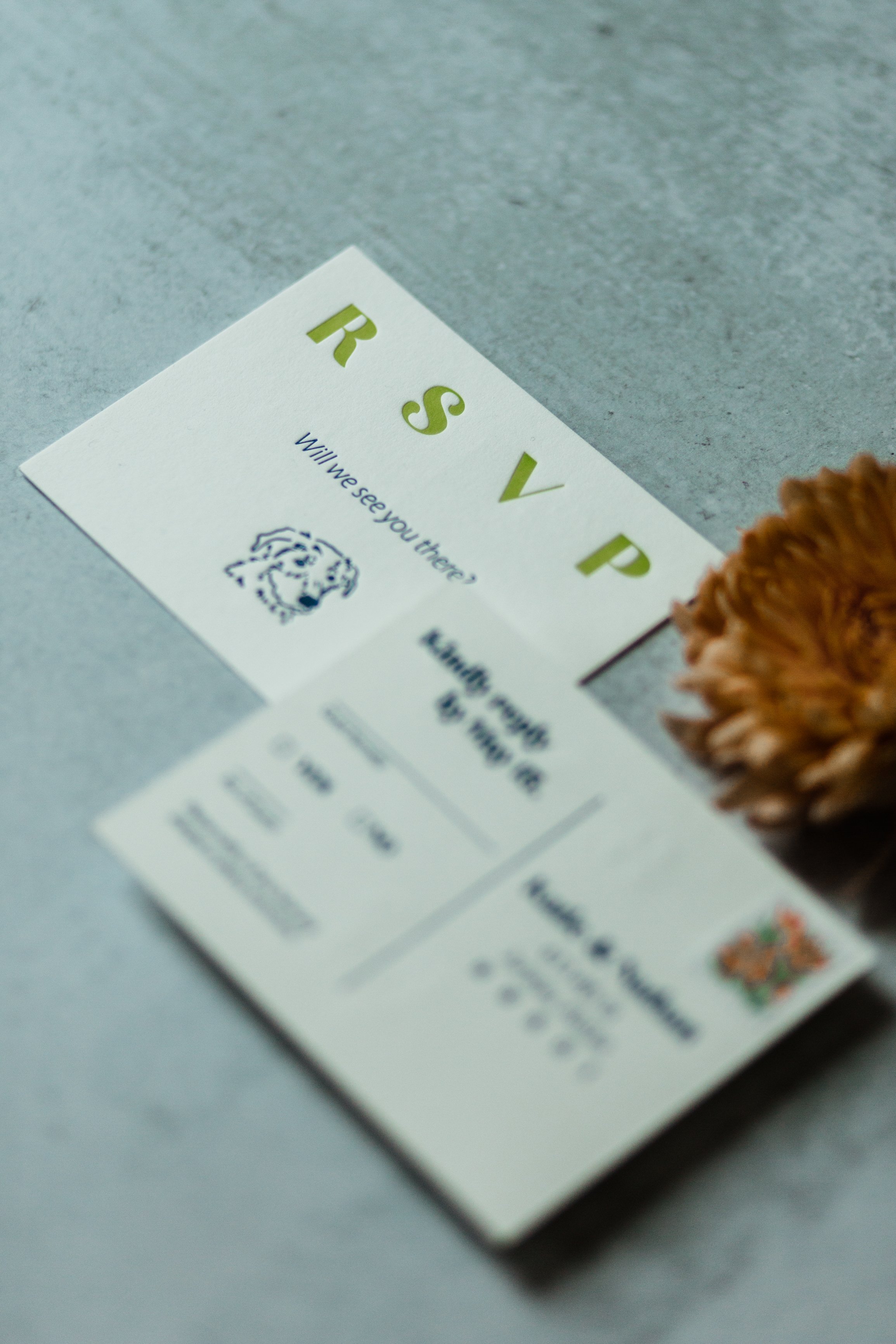
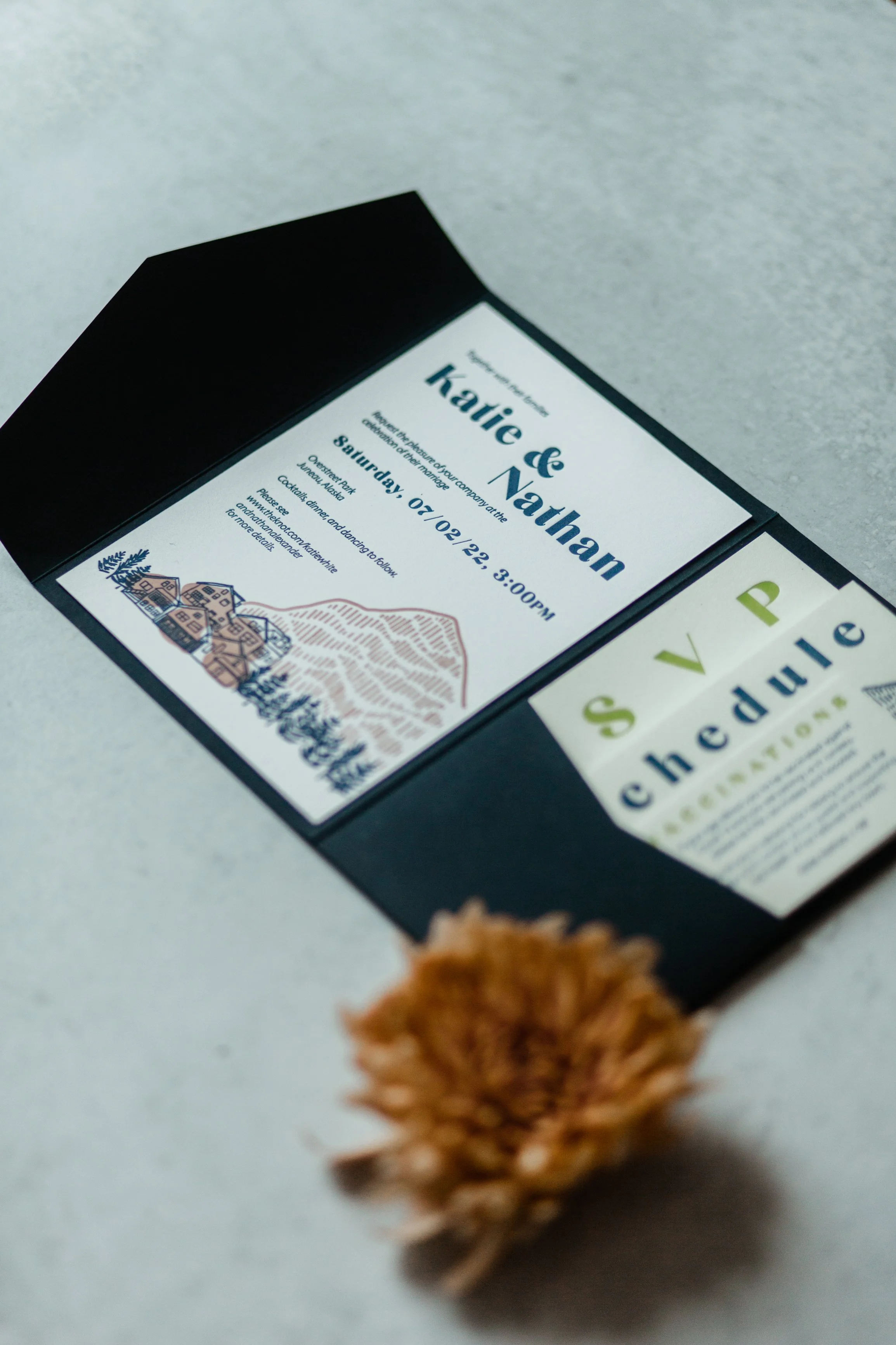
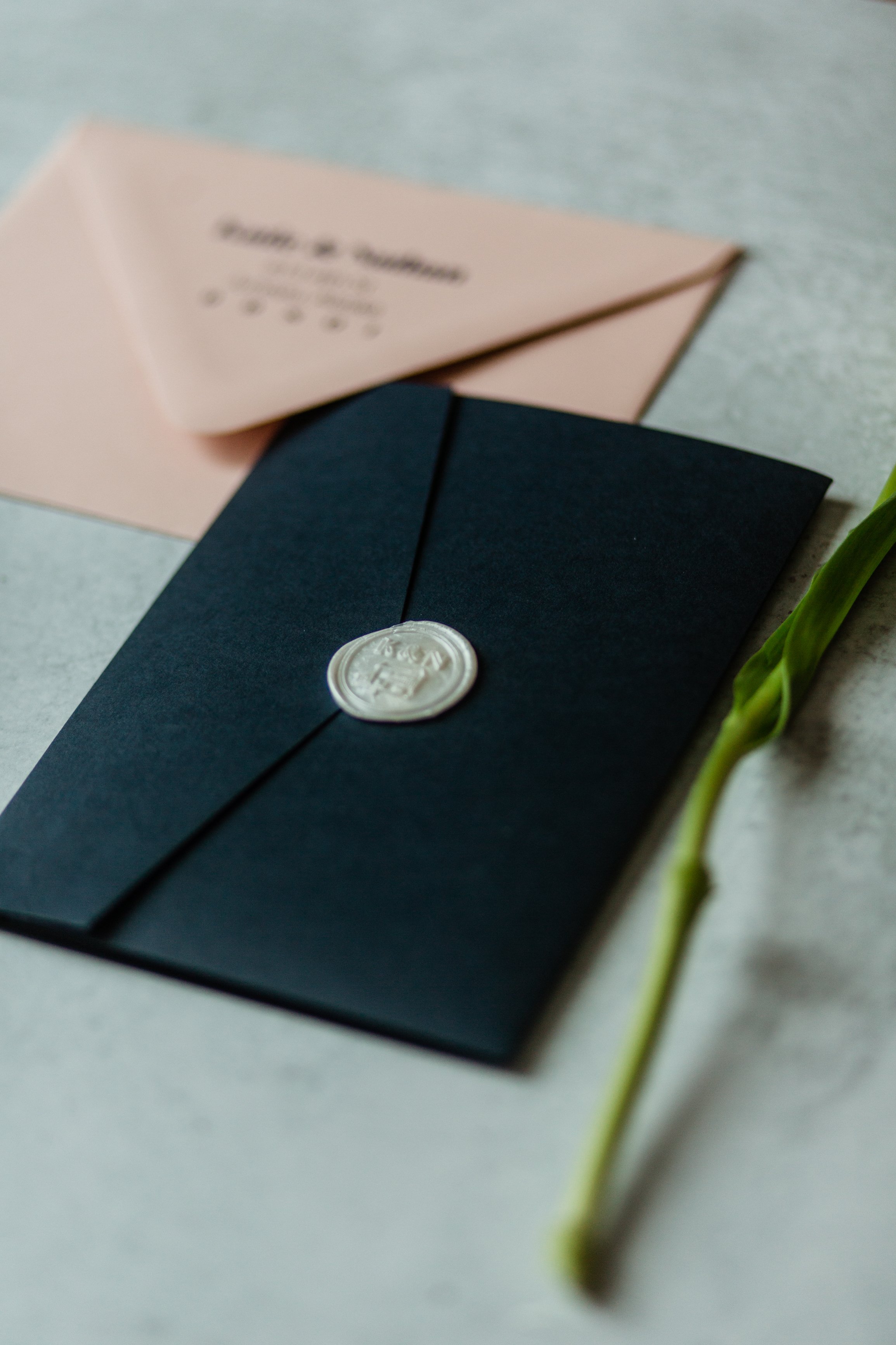
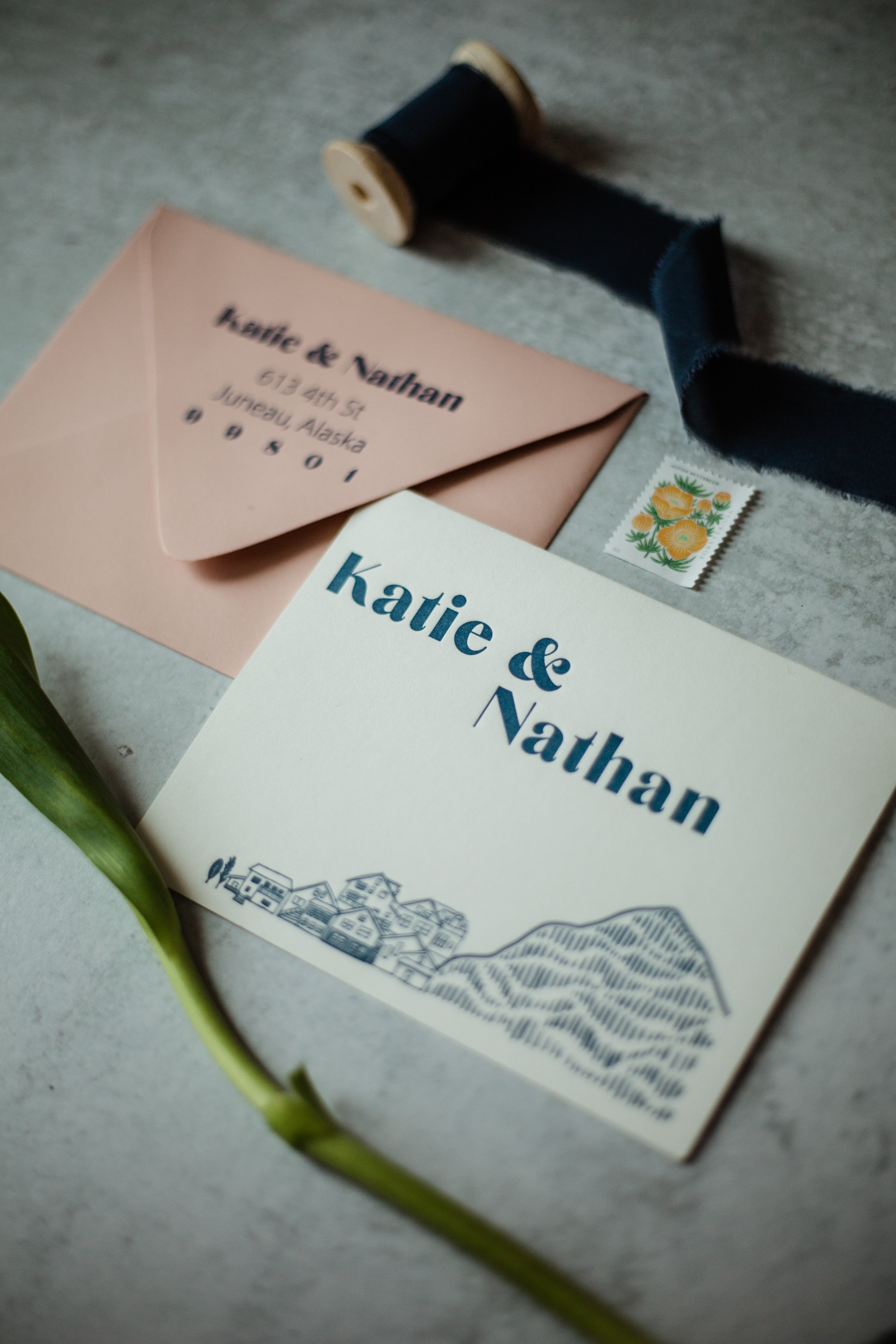
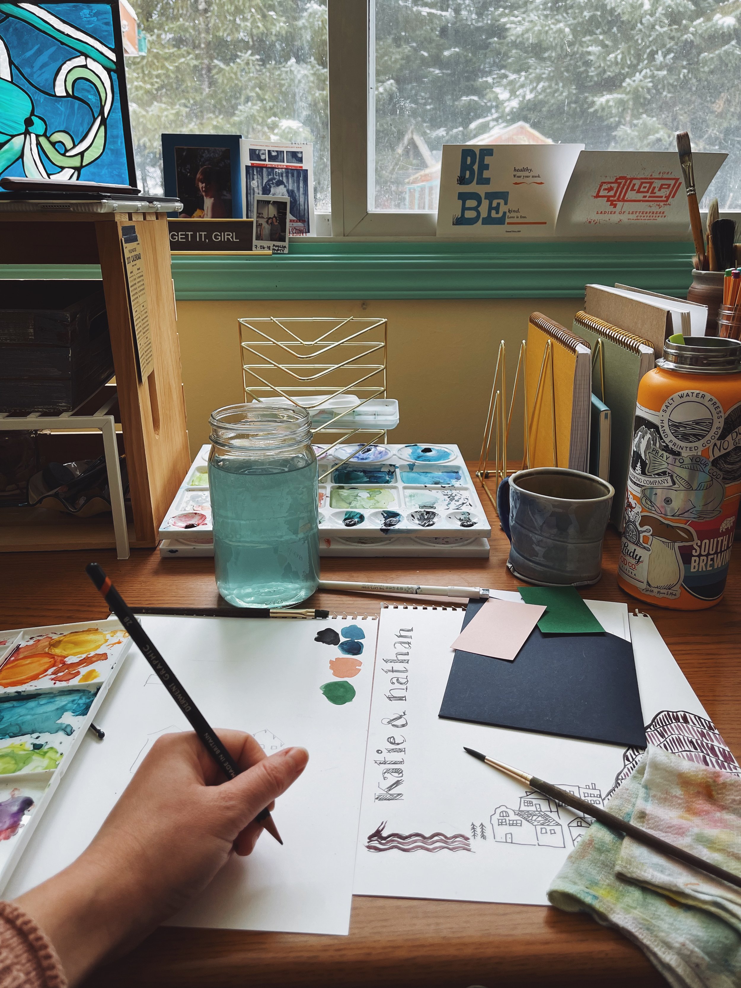
My illustration subject and style immediately focused on Starr Hill. Katie loved sketched, abstract representations, so I get to really play around in a loose, hand-drawn style and contrasting color combinations. We settled on a deep, dark indigo, with a muted dusty rose and pops of bright green chartreuse to keep things lively. An afternoon spent walking around the Starr Hill neighborhood gave me source photos of their friends’ houses. Each house was incorporated into a stacked city-scape nestled at the edge of a mountain, surrounded by trees in the main invitation design. Their dog Aki, a neighborhood celebrity, became the star of the RSVP postcard - her inquisitive face placed over a cheeky “Will we see you there?” prompt. The Starr hill landscape was re-sized and used to tie in the Schedule of Events tri-fold. Custom wax seals with Katie & Nathan’s initials and house secured all of the invitation pieces in a deep indigo pocket. I was honoured to hear that feedback on their invitation suite was immediately positive - and I’ve received may messages in the meantime that people have kept the invitation up on the fridge nearly a year later.
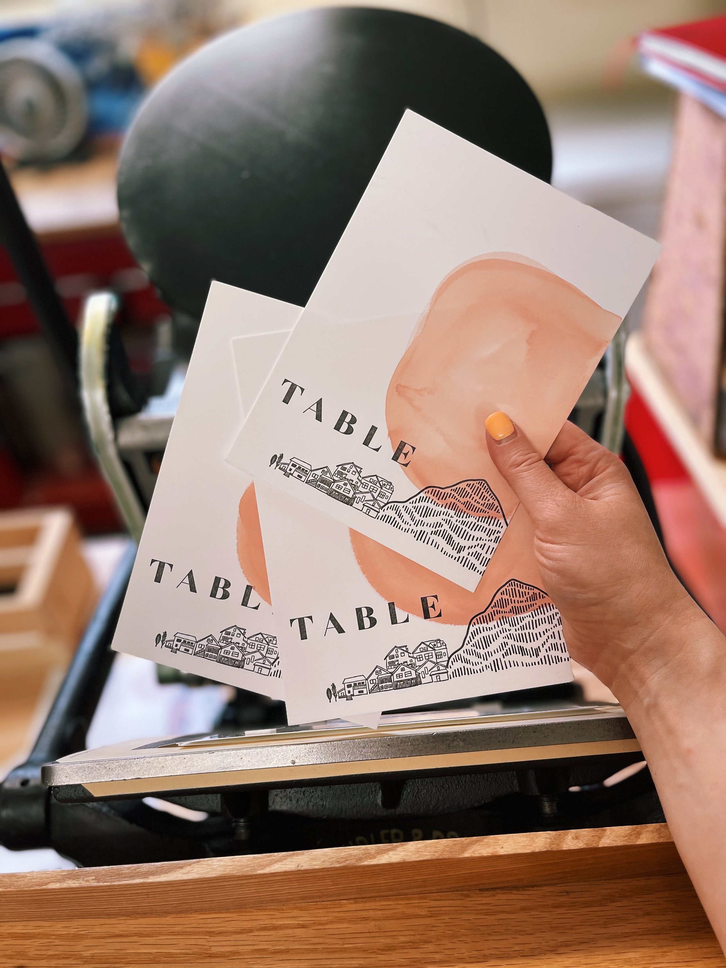
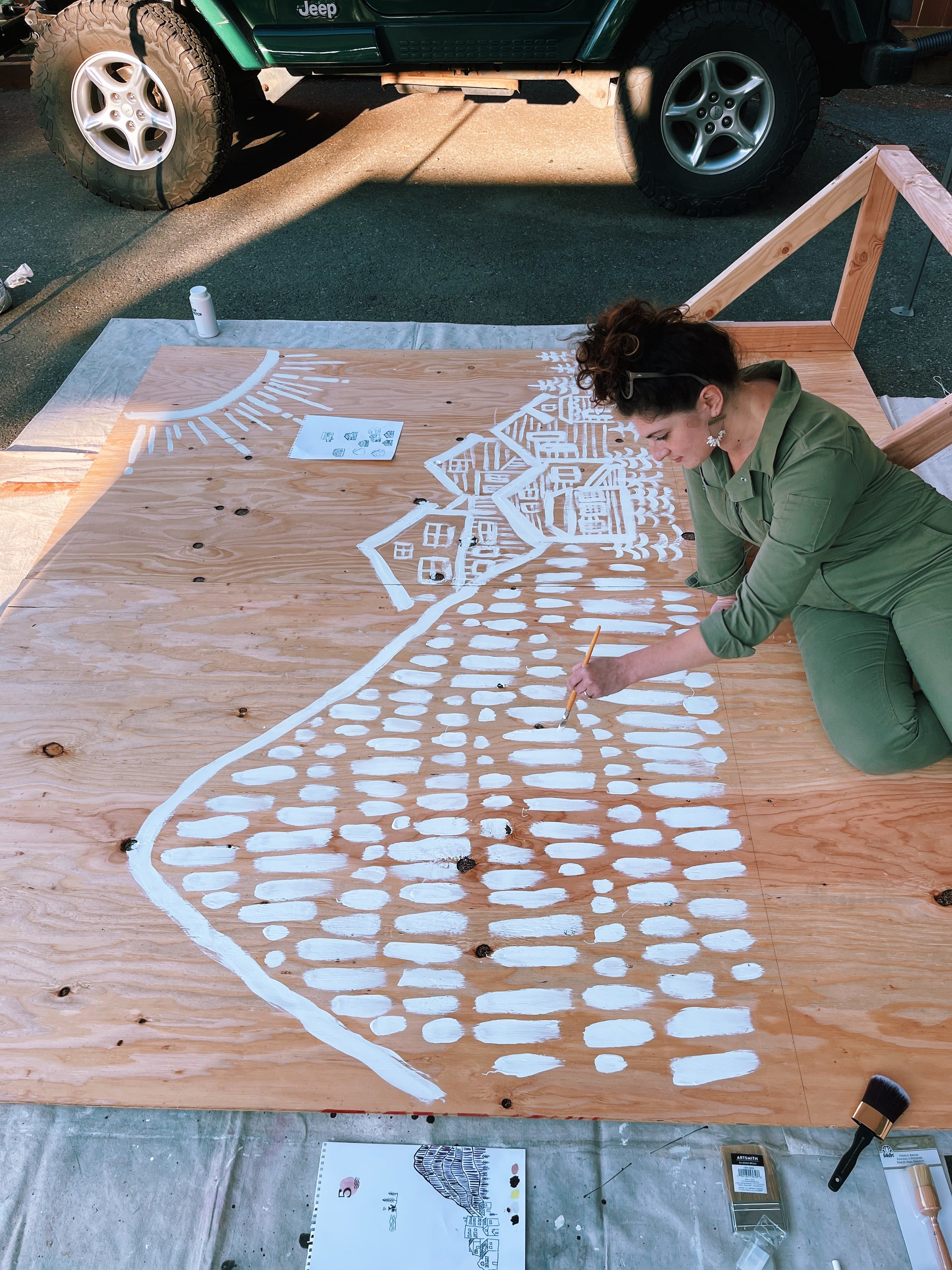
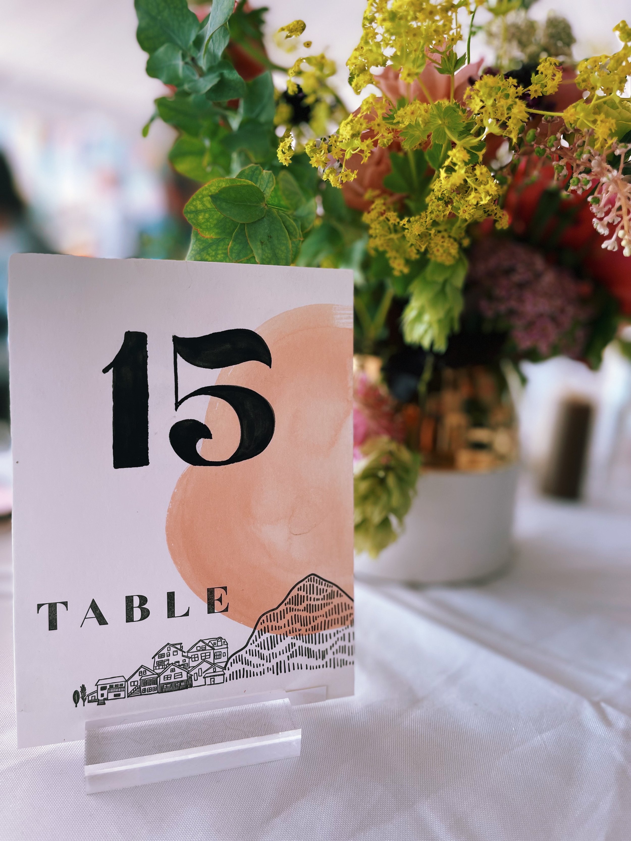
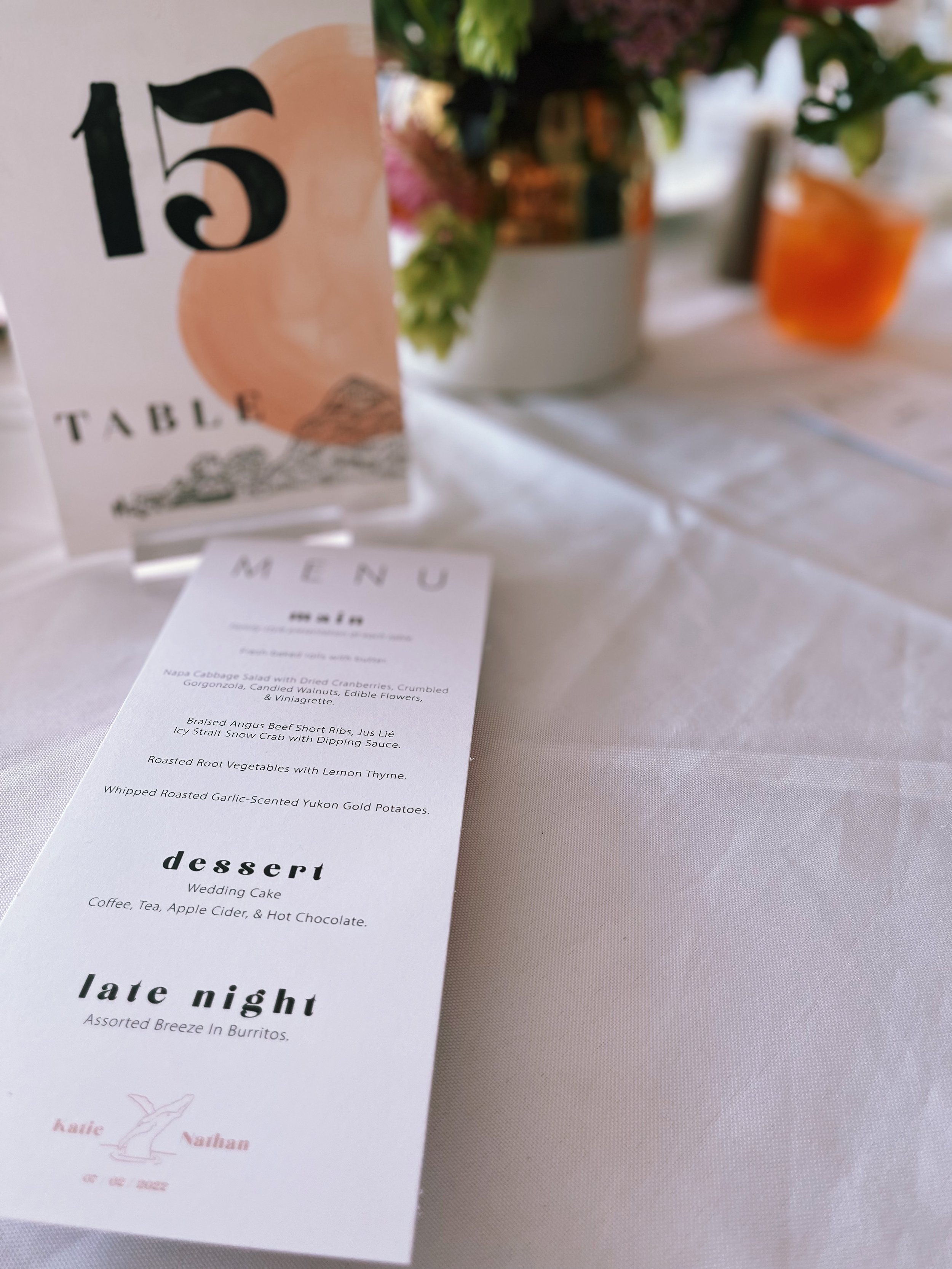
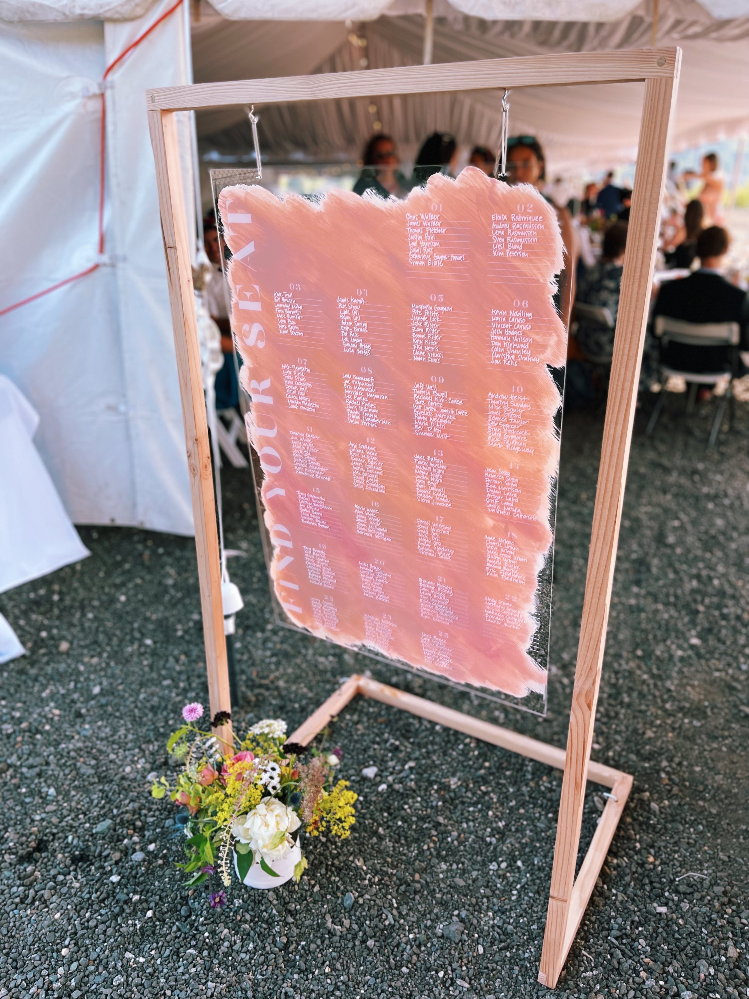
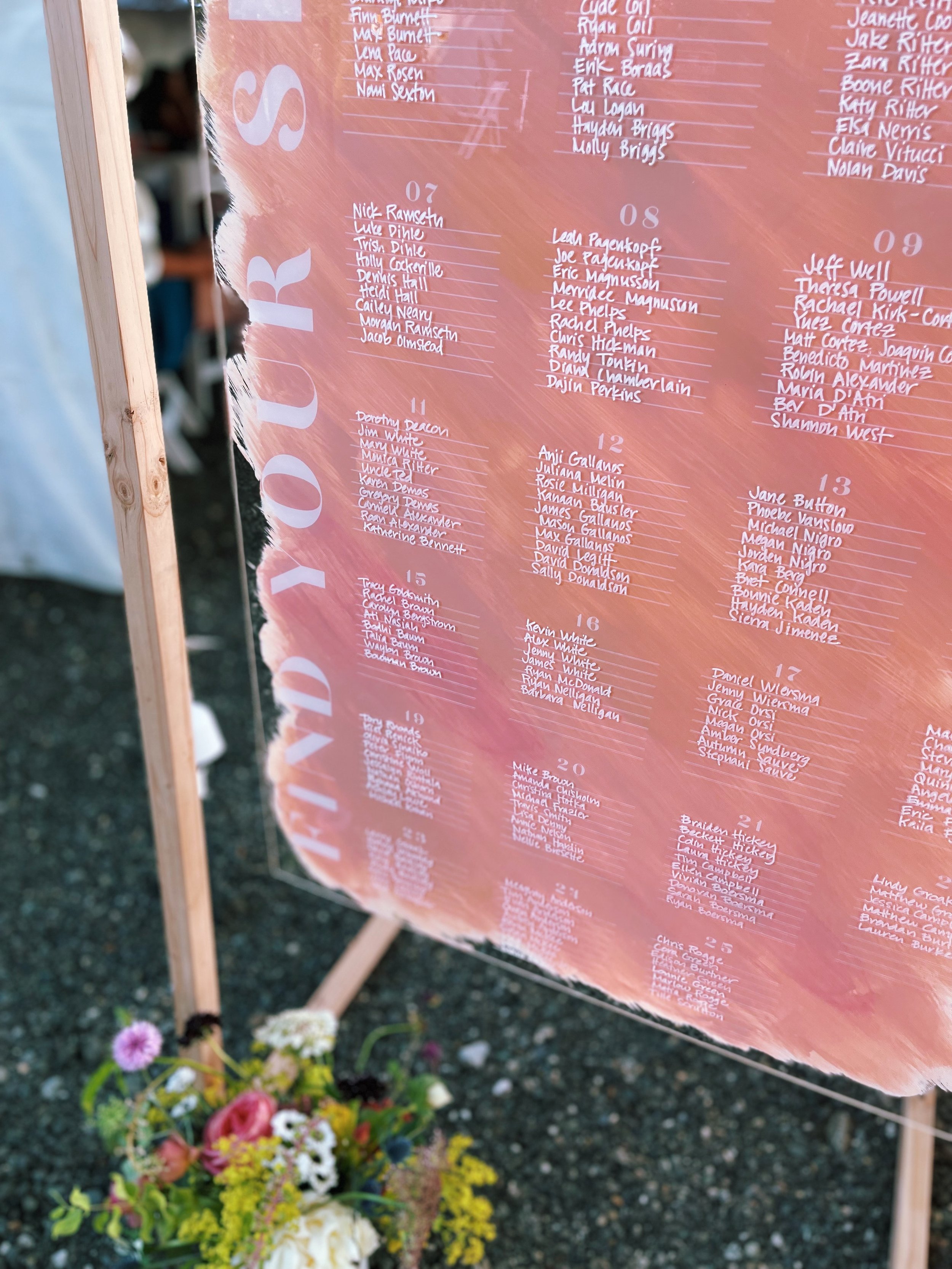
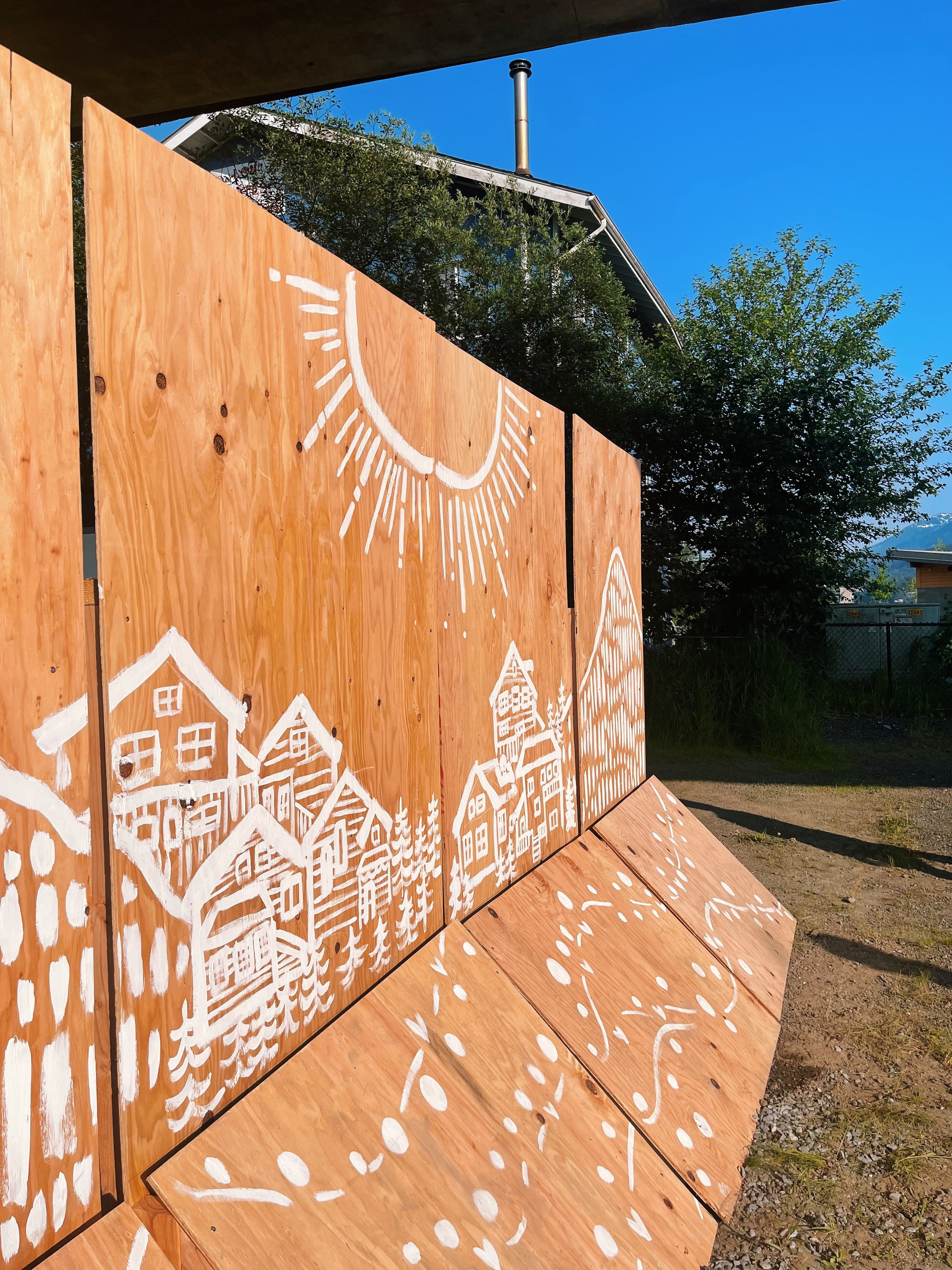
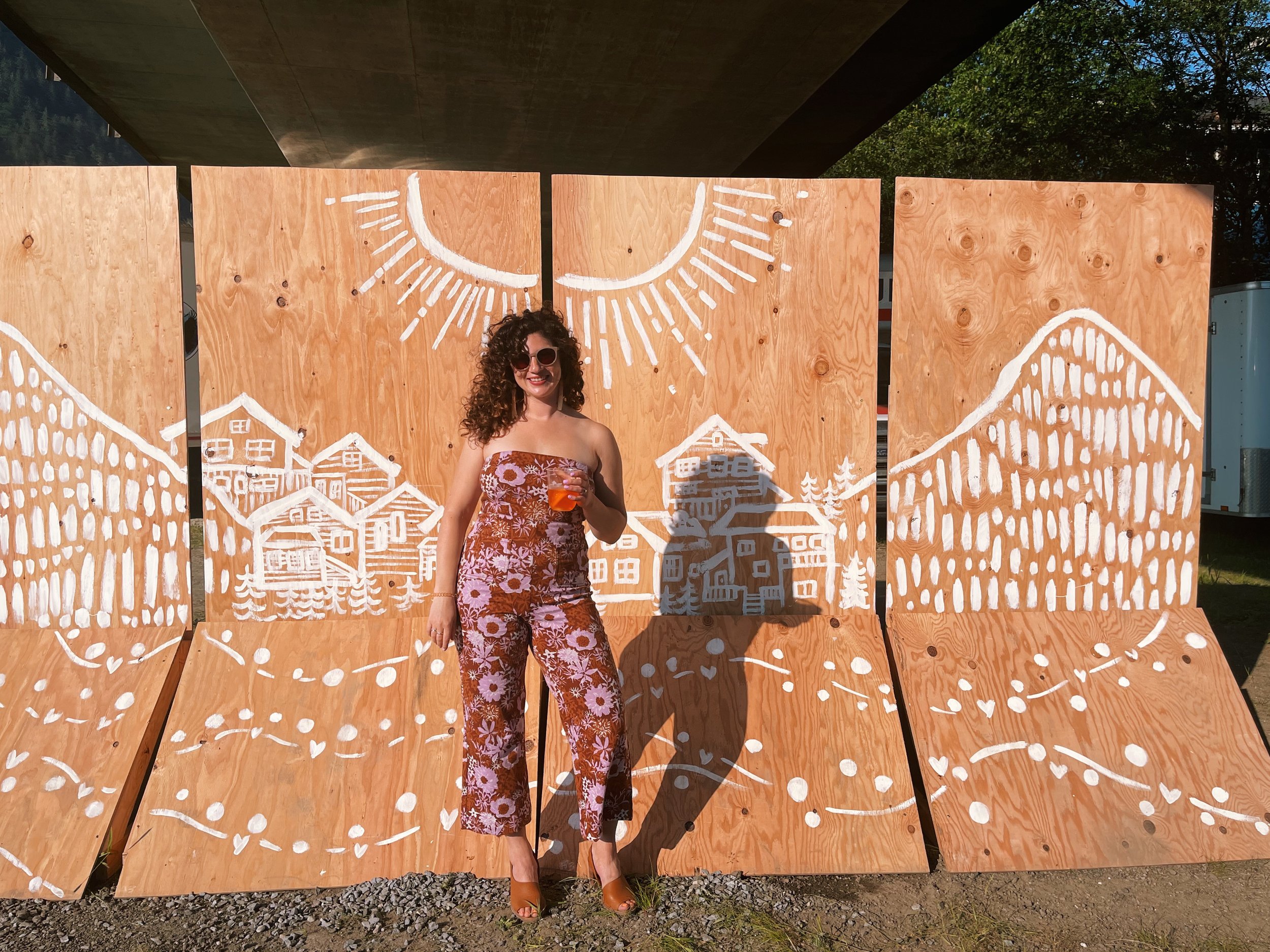
When summer approached, Katie asked if I’d be interested in taking on day-of signage. I was thrilled to keep creating along this vein, and we worked on a plan for menus, table numbers, an escort display (or seating chart), and even a wood panel wall to hide the catering team! I combined all kinds of print and illustration methods - digitally printed menus, welcome, and bar signs in their wedding suite branding, hand-painted and letterpressed table numbers, a custom painted & handwritten escort sign (with a frame generously built by K+N’s friend), and four standing wooden plywood panels with the Starr Hill landscape hand-painted in a rolling white sketch. These plywood panels were originally meant to hide the port-a-potties and catering vans, but eventually served as a photo backdrop throughout the day. A delightful twist.
If you’re a printer and have made it this far, you’ll think “hot damn, she struck client gold.” It’s true - it’s not always we get lucky enough to have a client with their own love of letterpress (Nathan knew what it was before I even explained it!), a big vision, and a design aesthetic that sparks immediate inspiration. I’m happy to say this was only the beginning of our relationship - and we’re all now good friends (small towns, amiright?!).
I could wax poetic forever and ever, but the dog and I need to go walk a trail and breathe some fresh air. As they say - a picture is worth a thousand words, and the gorgeous flat lays are all courtesy of Sydney Akagi photography.
PROJECT SUMMARY
Wedding Invitation Suite
Iinvitation, A7, 118# cotton paper, letterpressed, two colors
RSVP postcard, A6, 236# cotton paper, letterpressed, two colors
Trifold schedule, custom size, 118# cotton paper, letterpressed, one color
Mini vaccination card, custom size, 118# cotton paper, letterpressed, two colors
Pocket, A7, 100#, blank
Wax seals, custom stamp and color
Envelope (invitation suite), A7+, return address letterpress printed
Thank you cards & envelope, A2, 118#, letterpressed, return address letterpressed
Dinner menus, custom size, 90#, digitally printed
Bar signs, 8x10in, foam-core, digitally printed
Appetizer cards, custom size, 90#, digitally printed
Escort sign, custom size, acrylic and hand-built wood frame, hand-painted, hand-lettered
Table signs, A7, 118#, hand-painted, letterpress printed
Plywood panels, 4’x8’, custom build, hand-painted